Quick Guides
Red Home - General
- Everything you need is still handy.
- We've kept: all the data; the lozenge buttons you browse by; and the same great search system.
- We want you to feel comfortable. But we've changed a few things to make it easier to get around.
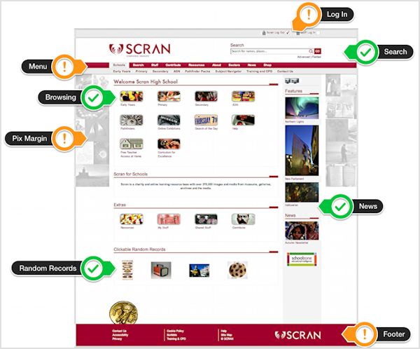
- The labels below explain in detail.
Red Home Page

| Login | The Log In has moved to the very top. It's where you expect to see it on many sites. |
| Search | Works exactly the same with the same great search and we've kept the Go button. |
| Menu | This has moved from left vertical to top centre and concentrates on navigation. It's tidier and makes records clearer. |
| Browsing | The lozenge buttons that let you browse round the website are the same, in the same grid with the same labels. |
| Pix Margin | Brand New: randomly generated selections refresh on each Home visit. Click once to emphasise and click again to go to the record. |
| News | News and features are still in the same place down the right side. |
| Random Records | The perennially favourite random records remain and refresh on each visit to the home page |
| Footer | The menu is now the place for navigation. The footer is for extras like legals, help and Scribble. |

 (
(


