Prepare for Purple 2
9th June, 2006
This series of articles prepares you for the new interface coming in July from Scran.
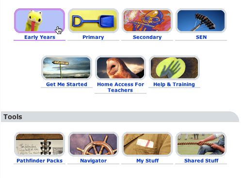
The scran icons go rounded in the new interface and "illuminate" with the colour theme when you point at them - so that you get instant feedback and know just exactly what you are clicking.
Note also the new fresh icons for sections on Scran.

Note the new page headers above with grey background and rounded right corner to fit in with the curving interface.
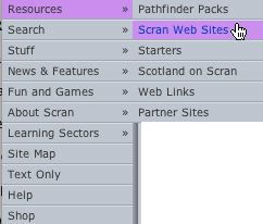
The colour scheme extends to the menu system too, as shown below.


 (
(


